In our previous post, Using Survey Data to Evaluate Walksheds, about passenger walk distances, we used the Rider Census to examine how accessible transit is to its users and found that passengers walked further than the assumed half-mile to stations at the ends of the Red and Orange Lines, while they walked less than this to stations in the center of our region. Our main conclusion, which is perhaps obvious, was that the structure of the network itself has a large impact on how passengers interact with the network.
We wanted to use this data set to look at passengers’ entire journeys rather than just their access point. To do so, we developed a metric we call “substitution propensity.” In a transportation network, each station is only attractive for a set number of destinations. For example, Savin Hill is a station on the Red Line, so Savin Hill is useful for trips north to downtown Boston. However, for trips west to Ruggles or Dudley Square, Savin Hill is not as useful; it’s likely that people would walk to the nearby stop for the 15 bus instead. In other cases, two nearby stations might serve very similar journeys: for example, much of the E branch of the Green Line and the Orange Line run nearly parallel to each other.
Substitution, as it relates to walkability, is defined here as the propensity at which passengers exclusively choose a particular route over other nearby alternative routes. Substitution explains differences in how passengers choose to access MBTA services: passengers will walk for longer distances in areas in which there are fewer service options. This is also a useful metric for determining what qualities passengers value in MBTA services. For example, there may be situations in which bus routes are not substituted for rail routes even when the bus route is faster because passengers may value frequency over faster travel times.
Methods
To measure substitution, we used the 2015-2017 Rider Census data, which includes information about the most recent journey survey respondents took using the MBTA system. We categorized each journey by its starting mode, or the type of service used at the start of the respondent’s journey, and its ending mode, or the type of service used at the end of the respondent’s journey. We defined four categories for the starting mode and ending modes: commuter rail, bus, light rail (the Green and Mattapan lines), and heavy rail (the Red, Orange, and Blue Lines). This resulted in each journey being assigned to one of 16 categories. To give an example, for a passenger who begins their journey at Lynn, takes the commuter rail to North Station, transfers to the Green Line and finishes their journey at Prudential, the journey would be classified as “Commuter Rail to Light Rail.”
While the survey data provided helpful insights on clustering and completed journeys, we had to account for undersampled evening commutes in the data set. We assumed that the trips from point A to point B by morning commuters are duplicated as trips from point B to point A by those same commuters in the evening, assuming that passengers use the same MBTA service for both commutes.
We then used the k-nearest-neighbors algorithm for each journey in the 2015-17 Rider Census to select the ten most similar origin-destination pairs. We determined similarity on the basis of a passenger’s origin and destination locations. The origin location would be the latitude-longitude coordinates of the street intersection nearest to the passenger’s home, and the destination location would be the latitude-longitude coordinates of the street intersection nearest to their workplace. The ten most similar journeys were determined by using four-dimensional Euclidian distance which are the longitude and latitude of the passenger’s origin point and the longitude and latitude of the passenger’s destination point. We calculated the percentage of the ten most similar journeys that belonged to the same category. That measure is the propensity for substitution. Using the same origin-destination pairs, if journeys among passengers varies greatly, the substitution percentage approaches 100%. If journeys do not vary, the percentage approaches 0%.
Next, we mapped the substitution metric in QGIS. The survey data was converted to a spatial point data set, with the location of the point determined by the latitude-longitude coordinate of the origin location. We duplicated the survey data while reversing the origin locations and the destination locations, effectively mapping every journey as two points: one representing the origin location and the other representing the destination location. Adjacent points were grouped into 500m hexagons, and the average propensity for substitution was calculated for each hexagon. At 100%, the ten nearest neighbors of journeys that started and ended in that hexagon were taken using the same MBTA service, on average. Alternatively, at 0%,the ten nearest neighbors of journeys that started and ended in that hexagon were taken using the different MBTA services.
Results
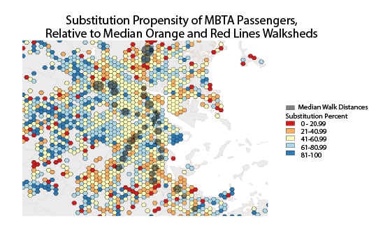
A few interesting trends are shown in the substitution map above. Immediately beyond the terminal stations of the Red and Orange lines, the metric approaches 0%; this is probably because some passengers choose to walk to the Red and Orange line stations, while other passengers choose to take a bus. Many passengers choose to take other MBTA services rather than walk near terminal stations that have large average walk distances, since this walk distance is less acceptable for different people. Another interesting observation is that substitution near Andrew and Broadway, the two Red line stations that serve South Boston, is relatively low; this is most likely because passengers are choosing to take one of the many bus routes rather than the Red Line. In fact, the eastern half of South Boston has a cluster of hexagons with percentages over 80%, meaning that the bus route is practical enough that passengers forego the walk to Broadway or Andrew.
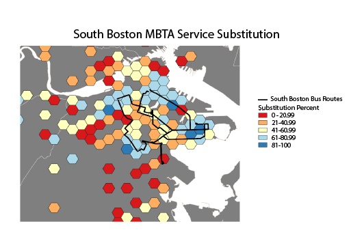
To illustrate the usefulness of this approach, we conducted an analysis focused specifically on South Boston. Five bus lines converge on City Point at the edge of South Boston: Routes 5, 7, 9, 10, and 11. We filtered the survey data to identify trips that started or ended with one of those bus lines (n=696), and since the survey data is biased towards morning trips, duplicated the survey data while flipping the starting and ending locations. We then applied the same k-nearest-neighbors algorithm to the data, and mapped the data using the same procedure. The resulting data showed the same cluster around City Point where all five of the bus lines converge.
Subsequently, we grouped the individual points using the k-nearest neighbor algorithm in to twenty clusters. The four variables we used to cluster the data were the origin location latitude, origin location longitude, destination location latitude, and destination location longitude. We filtered out the clusters with less than 20 data points, leaving twelve clusters, which enabled us to identify unusual trip patterns and ignore them. For each usable cluster, we calculated the average substitution percent and plotted the clusters as lines, with the endpoints of the lines representing the average origin and destination locations of passenger journeys in that particular cluster.
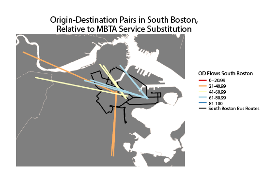
The resulting map illustrates that passengers using the bus network, whose journeys start or end near the western portion of South Boston, typically use the same bus route. Passengers whose journeys begin near Andrew or Broadway, however, use different bus routes to get to serve the same journey. This is potentially a sign that some of the bus routes in South Boston could be consolidated without substantially impacting passenger experience.
Conclusion
In the last two posts, we have used the Rider Census data set to examine how people access transit in greater detail than is usually possible. First, we found that the distance traveled to access transit on foot varies much more than the commonly applied rule of thumb of 0.5 miles. In this post, we found that people, perhaps unsurprisingly, use different transit services when they have multiple options. Importantly, we do not know from this analysis if an individual might choose different services on different days, nor the reasons why they might choose one service over another. Future analysis can examine these questions, using this and other survey data.